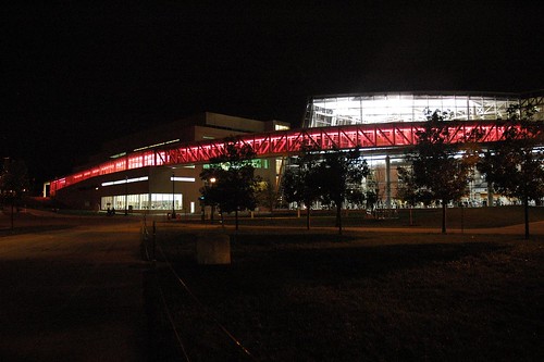
Even within an oeuvre like Antoine Predock’s—characterized by fragmentation and juxtaposition—the Recreation and Physical Activity Center at the Ohio State University is unusually scattershot: materials appear and disappear, glare and reflection are widespread, spaces compress and release at a dizzying pace, et cetera… but look at that red thing! That red thing is Predock’s strategic attempt at unifying a fractured mess of a building. The red thing is what matters here, not the material and spatial juxtaposition or the fragmentation of form. The red thing is an o verdetermined form, like those that so captivated Freud in his dream analyses: to use an architectural vocabulary, it is a multi-functioning element par excellence. Let’s explore some of its purposes.
First of all, the red thing is culturally resonant. It can be interpreted as part of a running track—signaling the building’s function as recreation center—as a horseshoe and therefore a ghost of its neighbor Ohio Stadium, or as a fragment of Ohio State’s red “O” logo. These are clearly not the only possibilities, just the most obvious. The red thing is imageable or has imageability, to borrow Kevin Lynch’s term. One can imagine that many a visitor has had their picture taken in front of it on football Saturdays, and it serves as a beacon for patrons and partiers alike. After dark, this beacon becomes particularly dramatic as the reflectance and transparency of adjacent material applications becomes more palpable. Red and pink light splashes the streetside façade and both sides of the central circulation canyon.
The difficulty of its structural realization is also more apparent at night. Heavy steel tube sections frame the bridge in a manner reminiscent of infrastructure, creating a shadowy texture that articulates the complexity of its enterprise. Bridging two independent buildings is never a simple proposition, and Predock complicates things by continuing the bridge overtop a workout room on its west end. The aforementioned tube sections figure prominently within this space, providing a visual disconnect that alleviates the feeling of being watched for those on elliptical trainers and treadmills below. This space is canyon-like, but it’s a canyon with an infrastructural element slicing through it. The canyon is a common device in Predock’s work, but typically his color palette is as subdued as the geographic phenomena it mimics. Color—at least any color that is not an earth tone—is uncommon in his buildings. The red thing is an extraordinary circumstance.
Informed by a love for the geography of the American southwest—stone outcrops, steep gorges and the like—Predoc k’s formal vocabulary is peculiarly attuned to complex programs such as that of the RPAC. It is common to be able to walk on or over his buildings, and he has even used the “red thing” strategy before: in his Tang Teaching Museum at Skidmore College [RECORD, May 2001] and the Nelson Fine Arts Center at Arizona State, pedestrian passages are deployed in a similar fashion. At Arizona State, the thing is even red! But these previous deployments weren’t as essential to the success of their designs. The ensembles at Skidmore and ASU are less tenuous and more pile- or mountain-like. The RPAC has neither the material nor formal consistency of these other buildings; it almost requires such a dramatic gesture.
So let’s say you’ve got a problem. You’ve won a commission for a building with an intimidatingly complex program in which needs and wants are contradictory. You want a building that feels like a totality, but the client keeps telling you that they need this or that to be separate or different. At Ohio State, Predock has provided an example for how to efficiently and inexpensively produce unity within such an ensemble. The red thing is a strategy. A concept. And it works.
 verdetermined form, like those that so captivated Freud in his dream analyses: to use an architectural vocabulary, it is a multi-functioning element par excellence. Let’s explore some of its purposes.
First of all, the red thing is culturally resonant. It can be interpreted as part of a running track—signaling the building’s function as recreation center—as a horseshoe and therefore a ghost of its neighbor Ohio Stadium, or as a fragment of Ohio State’s red “O” logo. These are clearly not the only possibilities, just the most obvious. The red thing is imageable or has imageability, to borrow Kevin Lynch’s term. One can imagine that many a visitor has had their picture taken in front of it on football Saturdays, and it serves as a beacon for patrons and partiers alike. After dark, this beacon becomes particularly dramatic as the reflectance and transparency of adjacent material applications becomes more palpable. Red and pink light splashes the streetside façade and both sides of the central circulation canyon.
The difficulty of its structural realization is also more apparent at night. Heavy steel tube sections frame the bridge in a manner reminiscent of infrastructure, creating a shadowy texture that articulates the complexity of its enterprise. Bridging two independent buildings is never a simple proposition, and Predock complicates things by continuing the bridge overtop a workout room on its west end. The aforementioned tube sections figure prominently within this space, providing a visual disconnect that alleviates the feeling of being watched for those on elliptical trainers and treadmills below. This space is canyon-like, but it’s a canyon with an infrastructural element slicing through it. The canyon is a common device in Predock’s work, but typically his color palette is as subdued as the geographic phenomena it mimics. Color—at least any color that is not an earth tone—is uncommon in his buildings. The red thing is an extraordinary circumstance.
Informed by a love for the geography of the American southwest—stone outcrops, steep gorges and the like—Predoc
 k’s formal vocabulary is peculiarly attuned to complex programs such as that of the RPAC. It is common to be able to walk on or over his buildings, and he has even used the “red thing” strategy before: in his Tang Teaching Museum at Skidmore College [RECORD, May 2001] and the Nelson Fine Arts Center at Arizona State, pedestrian passages are deployed in a similar fashion. At Arizona State, the thing is even red! But these previous deployments weren’t as essential to the success of their designs. The ensembles at Skidmore and ASU are less tenuous and more pile- or mountain-like. The RPAC has neither the material nor formal consistency of these other buildings; it almost requires such a dramatic gesture.
So let’s say you’ve got a problem. You’ve won a commission for a building with an intimidatingly complex program in which needs and wants are contradictory. You want a building that feels like a totality, but the client keeps telling you that they need this or that to be separate or different. At Ohio State, Predock has provided an example for how to efficiently and inexpensively produce unity within such an ensemble. The red thing is a strategy. A concept. And it works.

No comments:
Post a Comment